Rhode & Steele E-Commerce
Client: Rhode & Steele (Design Lab)
Industry: Retail
My Role: UX/UI Designer & Researcher
Physical to digital conceptual product design work for a fashion retailer.
My Deliverables
I worked on the full UX/UI process from user and competitive research to full branding and design to prototyping and user testing.
User research - Information Architecture - Wireframing - UI Design - User Testing
The Challenge
I created an e-commerce site for fictional brand Rhode & Steele, a physical retail location that wanted to take their offline success online. The project included a full re-brand, including new logo, typography, and color palette as well as a mock-up of a responsive homepage and prototype.
The Research
To begin initial research to jumpstart the project, the following approaches were used in order to gain further insight on the target user:
Competitor Analysis: allowing deeper insight into market trends and the current strengths & weaknesses of the industry.
Competitors Main Strengths: Clean User Interface Design, Large Variety of Categories, Reviews/Social Feeds, Clean and Easy Check-Outs, Omni=Channel Shopping Experience
Competitor Main Weaknesses: Busy Landing Pages, Trend Collections Too Vague, Check-Out Not Detailed Enough, No Favorite or Save Option, Some Categories Hard to Find
User Interviews: identifying the major wants, needs, and pain points of the key consumer in various demographics. There was a total of 4 women, 28-45 years old who all shopped within the last 2 weeks and value both trends and deals.
Main Needs/Wants: Wide selections that are easy to filter, Emphasis on deals & promotions, What’s new collection, Reviews and social feeds, Quick shipping or in-store pick-up, Easy & free returns.
Main Pain-points: Fit is never reliable, Quality is being sacrificed for pricing, In-store collection too small, Check-out too long or unreliable, Needs things at the last minute.
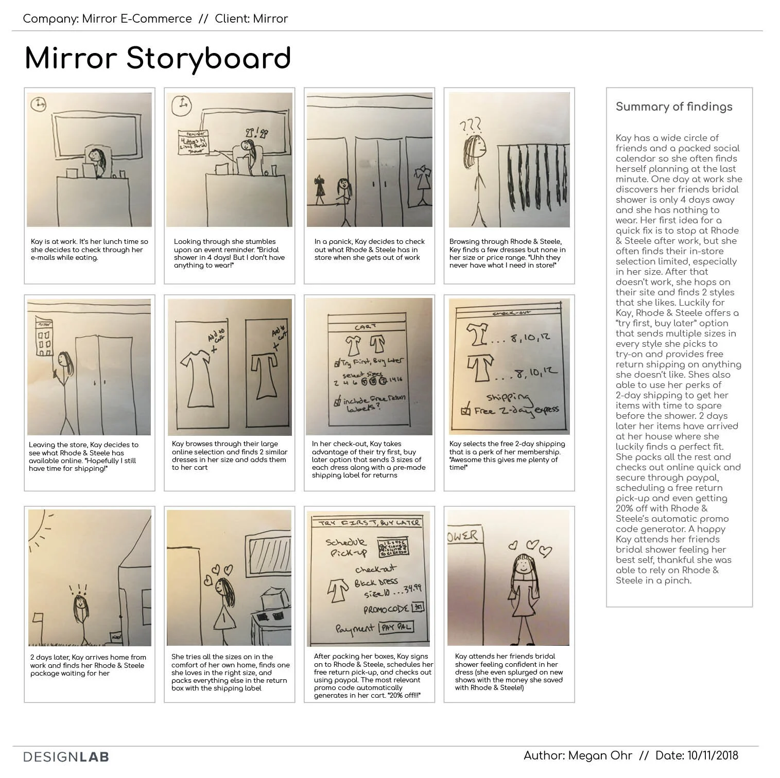
The consensus of the research identified that the users’ biggest concerns were about fit, promotions, and shipping/returns. In order to further understand the data and what the site would need to solve in a more human way, a persona, empathy map, and story board were created to embody the wants, needs, and pain points of the main user and the decisions they may make.
The UX
After gaining a full grasp on the target user and the problems being solved for, the next step was to think through the structure of the site through the use of a card sorting to see how the target demographic organizes data within the usual retail categories and then creating a site map based on the findings. Once the organization of the information within the site was clear, the potential interactions were fleshed out through understanding both a task and user flow.
After the flows were sketched out, the design phase began through basic wireframes of the homepage and other main pages of the flow. Low-fidelity wireframes were created of the homepage for a desktop, iPad, and iPhone to show the responsive nature of the site and how it would react to each screen size. The next step was then to create the low-fidelity versions of the main pages of the flow to get an idea of the main layouts.


The Design
Beyond the workings of the site’s infrastructure, organization, and interactions, the brand needed a new face. A style guide was created including new logo mock-ups, color palette, and typography. Once completed, this identity was then translated to the UI Kit as well as higher fidelity mock-ups.
While the low-fidelity wireframes focused on the layouts main pages, the high-fidelity added in both the created UI elements as well as the main interactions of the flows. Beyond the main pages, all of the pages showing each interaction were created at the high-fidelity to make-up the prototype for testing.
Once the UI and higher fidelity wireframes were in place, the prototype was created showing an interaction that hit all of the major concerns for the consumer including a homepage with a highly visible what’s new collection and a try first, buy later option to address fit problems, a category page with a wide selection that is easy to both filter and sort, a product page with easy access to shipping and return information, and a seamless check-out that includes a promo code generator as well as the Paypal option that allows for quick autofill. Link to Prototype
The User Testing
Testing: With a working prototype, usability testing was done on 6 more women of the same demographic. Overall the feedback was very positive, all felt the pages were clean and concise, that they highlighted the main information that they look for, and the navigation was very easy to use. The few hesitations they had were in the apply button for the filters, clarity that the high-low and low-high sort were for pricing, and the need for a manual way to input the promo codes.
Next Steps: Adjustments were made on the prototype based on the above feedback from the usability testing. Any further steps would be to create a higher fidelity prototype with more interactions, conduct more testing and continue to update as needed.


