Imvexxy Website Design
Client: TxMD (McCann New York)
Industry: Women’s Health
Timeline: December 2020 - March 2021
With a reworked strategy aimed with focus on self-care, TxMD brought in our digital team for UX/UI design for the product Imvexxy, a post-menopausal treatment for painful sex,
My Role
I worked as the lead Product designer within a small team consisting of strategists, UX researchers and producers. My main deliverables were:
Content Strategy - Information Architecture - Style Guide - Wireframing - UI Design - Functional Specifications
The UX Challenge
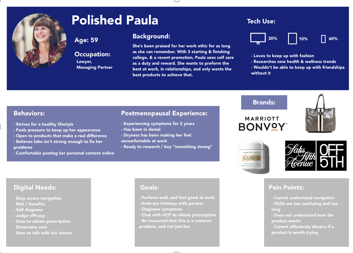
With a strategy shift to focus on self-care, the digital team was tasked to create a website content strategy and infrastructure to best educate consumers on post-menopausal care and Imvexxy as a solution. To begin, we pulled from overall strategy data as well as stakeholder interviews to define the client goals and the user’s needs which in turn define our web strategy, key features, and information architecture.
After defining our structure we dove into the content strategy for each page. We then walked copywriters through the content to begin working through while I started on the wireframing. From there I worked through the IRI, navigation, and footer with low-fidelity wireframes, followed by the rest of the content mid-fidelity including copy. As we were focused on the content and navigation, we created mid-fidelity prototypes for desktop and mobile for user testing.
The User Testing
While user testing was outsourced by the client, we stayed as involved as possible. We created specific user tasks and scenarios we wanted the users to achieve and other clear instructions. Overall the testing was successful and user’s were able to navigate both breakpoints with ease. The testing did uncover a few areas to optimize which we adjusted in our designs, including adding a sticky navigation to combat excessive scrolling, decreasing the size of the mobile IRI, and turning the navigation options to questions.
The UI Challenge
With our infrastructure in place. The UI process presented its own challenges. While I needed to work with the existing branding, I was challenged with finding a way to reimagine how we use them. I also had to keep in mind that the site needed to be evergreen and house different campaign imagery over time, starting with the illustration heavy interim campaign followed by Reign, a queen focused lifestyle campaign. I approached this by coming up with multiple concepts that catered to different needs to workshop final aesthetic with clients. These options included:
The Design
The design concept process with the client was ultimately successful, mixing and matching different elements from different options to land on a final aesthetic.
The design system continued to evolve over time. I worked closely with the design team to work through the full iconography system and the creative team on choosing images from the first campaign, while also creating a UI kit for developers. As these elements were finalized, I added the final assets to the desktop, tablet, and mobile wireframes for the first campaign launch.
While in development, I started working on the reskin for the Reign campaign. I worked closely with creative to concept the different images and animations for the website to be shot during the campaign shoot. Once completed, we updated the wireframes as well as made some banner and layout optimizations based on feedback from the first launch.
The Development
We created a functional specification PDF for the first round of development. This led to a longer QA processes and lots of bug fixes on first launch. With the Reign campaign we utilized a collaborative working space that allowed communication real time for a smoother process.
The Launch
The Imvexxy website campaign 1 went live January 2021 followed by the Reign campaign in May. Small bugs and formatting is continuing to be improved by developers and future optimizations will be made as analytical data and heat mapping give us more insight to users needs.


